Case study
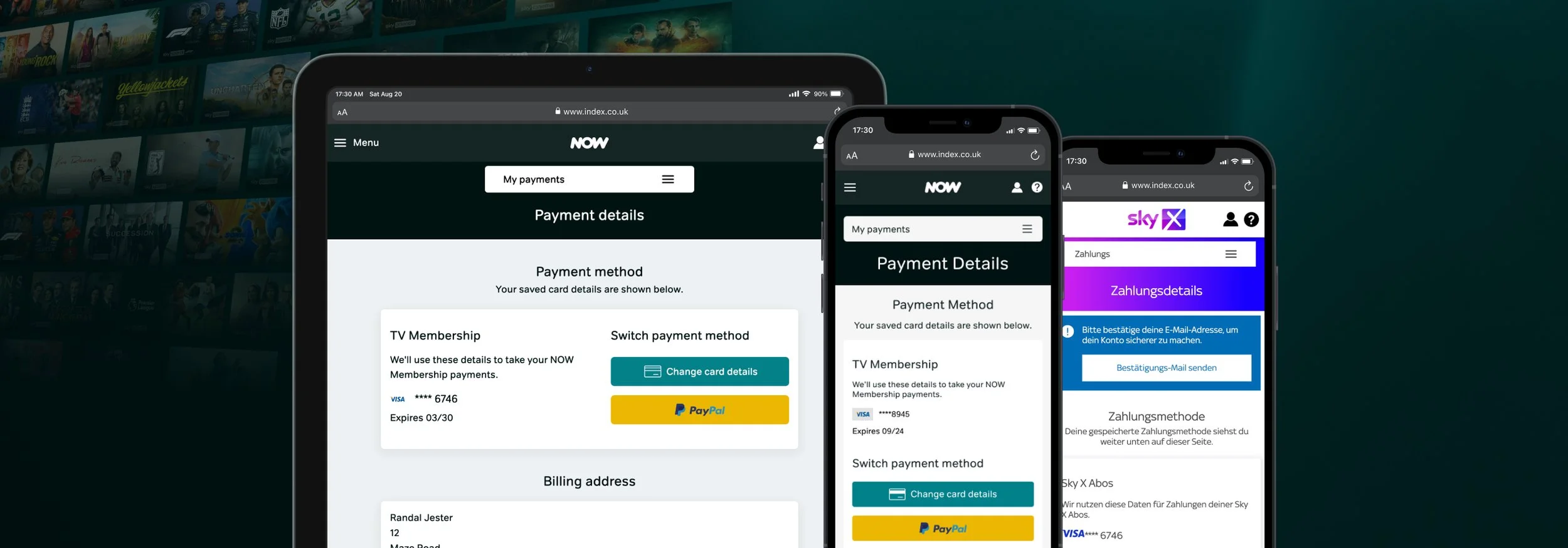
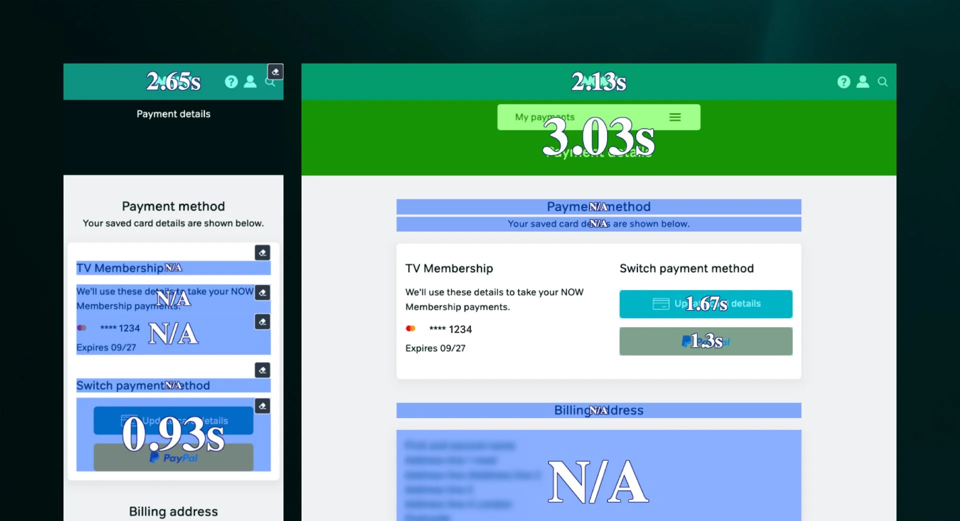
NOW Payment Details
Project summary
To align with the recently refreshed commercial brand, NOW Digital Services has been progressively enhancing its account management web experience.
The Payment Details page was next in line for updating. The main aim was to address all customer pain points while updating the UX and UI, helping to create a seamless journey with the other NOW web experiences: EComm, Checkout, and Help.
Role: Senior UX/UI designer
Approach: user insights and feedback, performance evaluation, competitor analysis, incremental and full redesign exploration, accessibility investigation, stakeholder presentations, engineer collaboration, post delivery quantitative data review
The challenge
Redesign the NOW Payment Details page to align with the updated brand identity, ensuring a fresh and cohesive user experience.
The successful redesign must resolve customer frustrations with payment options, clarify confusing messaging, and increase customer goal achievement for the Payment Details page, which is a critical KPI for the NOW account management team.

Research
Alongside legacy research showing customer frustrations with managing payment details, the following help us define primary and secondary goals: customer feedback, analytics, and metrics.
Contact rate
Contact rates have steadily increased and decreased across My Account. However, billing and payment issues account for a large number of customer contacts.

Goal achievement
Goal achievement has improved overall. However, there is still room for improvement when it comes to the Bills & Payments journeys.

Community complaints
NOW’s community website is a great source of feedback about account management. It highlights customer difficulties quickly and effectively and allows the NOW community to request improvements to the account management experience.
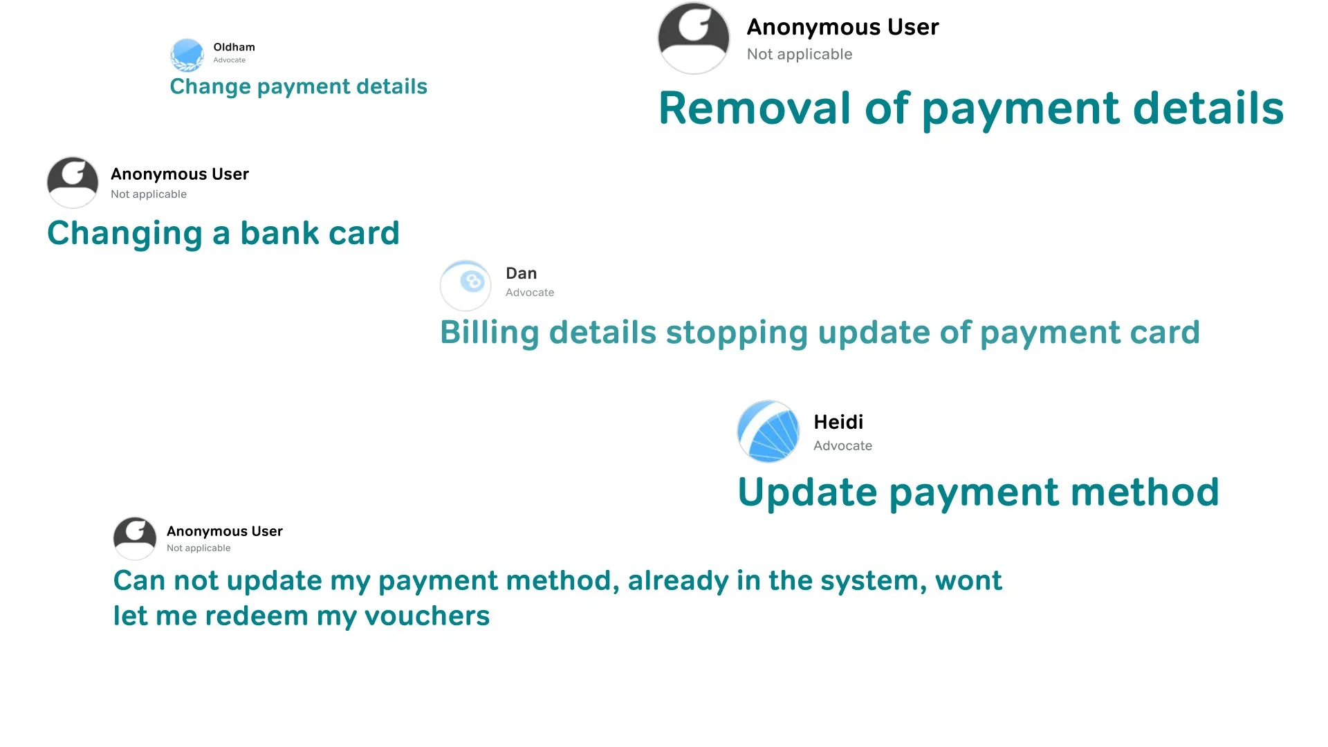
Key observations
Customers are not aware of the different payment types available.
Customers find it difficult to change payment types.
Voucher redemption is tricky. Users are confused about whether vouchers have been redeemed and whether they replace other payment methods.
Card failures, updated card status, and system cancellations of debit/credit cards are not communicated clearly enough.
Dead-end error messages need replacing.
Lack of third-party payment methods, along with the many accessibility and security benefits that come with them.
Competitor research
While some competitor analysis existed from the previous redesign, we decided to look at modern examples of payment pages.
The research highlighted many similarities, including:
Many competitors adopt a single-page experience.
Clean, minimalist designs are an industry standard.
Vouchers and gift cards are grouped with monetary payment types.

Initial ideas
Following agile and lean UX principles, a quick solution was required with the option of future iteration.
Emphasising engaging design patterns and modern best practices, the aim was to create a seamless and enjoyable user journey.
Design, Product, and My Account stakeholders identified both single- and multiple-page journeys as potential areas for further exploration.
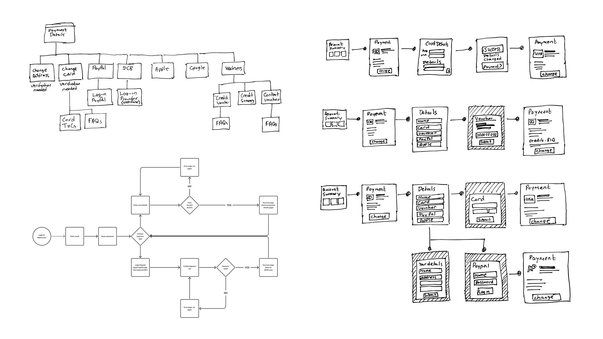

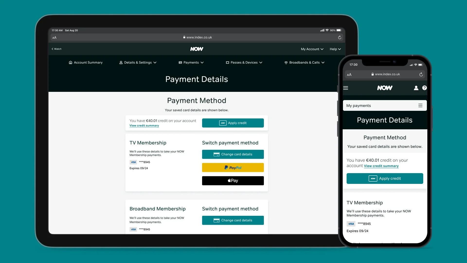
Payment page enhancements
Initial exploration broadened the possibilities of a Payment Details page. However, there was some hesitation around the scope of this redesign and whether we could completely redo functionality.
Several themes and questions emerged when looking at the best way to reconstruct and enhance the Payment Details page:
How might we provide a more welcoming experience?
How might we reduce journey length?
How might we make the payment experience more visually appealing?


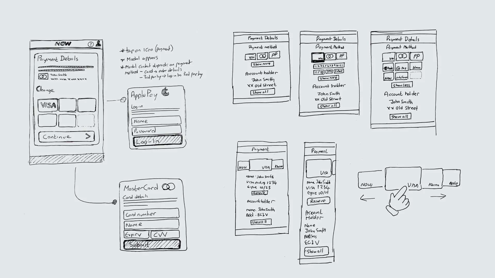
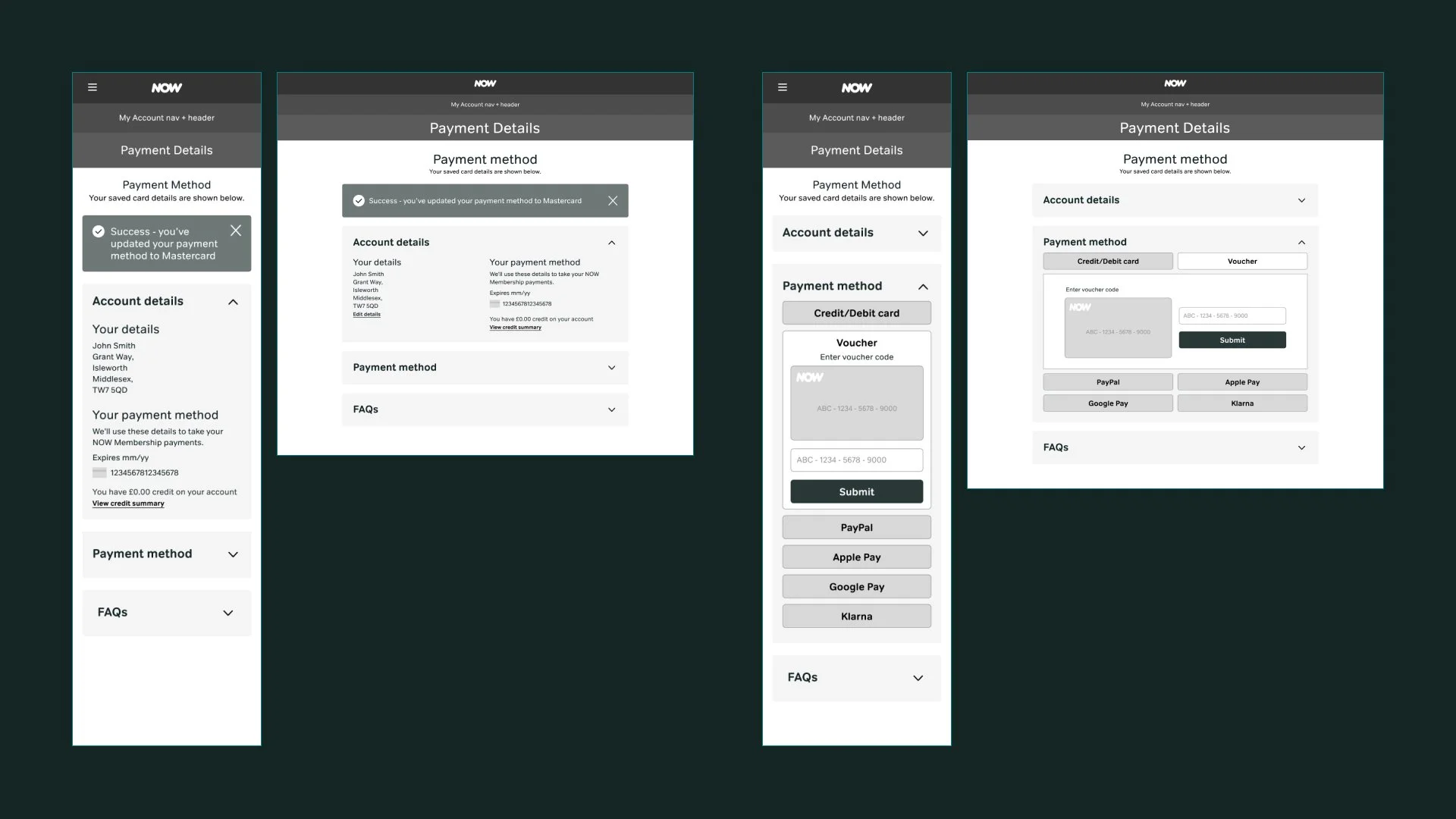
MVP Final
We decided on an MVP release that would solve the main user problems and validate our hypothesis. The long-term aim is to continually iterate and improve, adding value to the NOW payment journey.
Primary MVP requirements:
All payment methods are on one page.
Use of current design system components.
Clearly show the current payment method.
Show all available payment methods.
Must scale for different territories and languages.

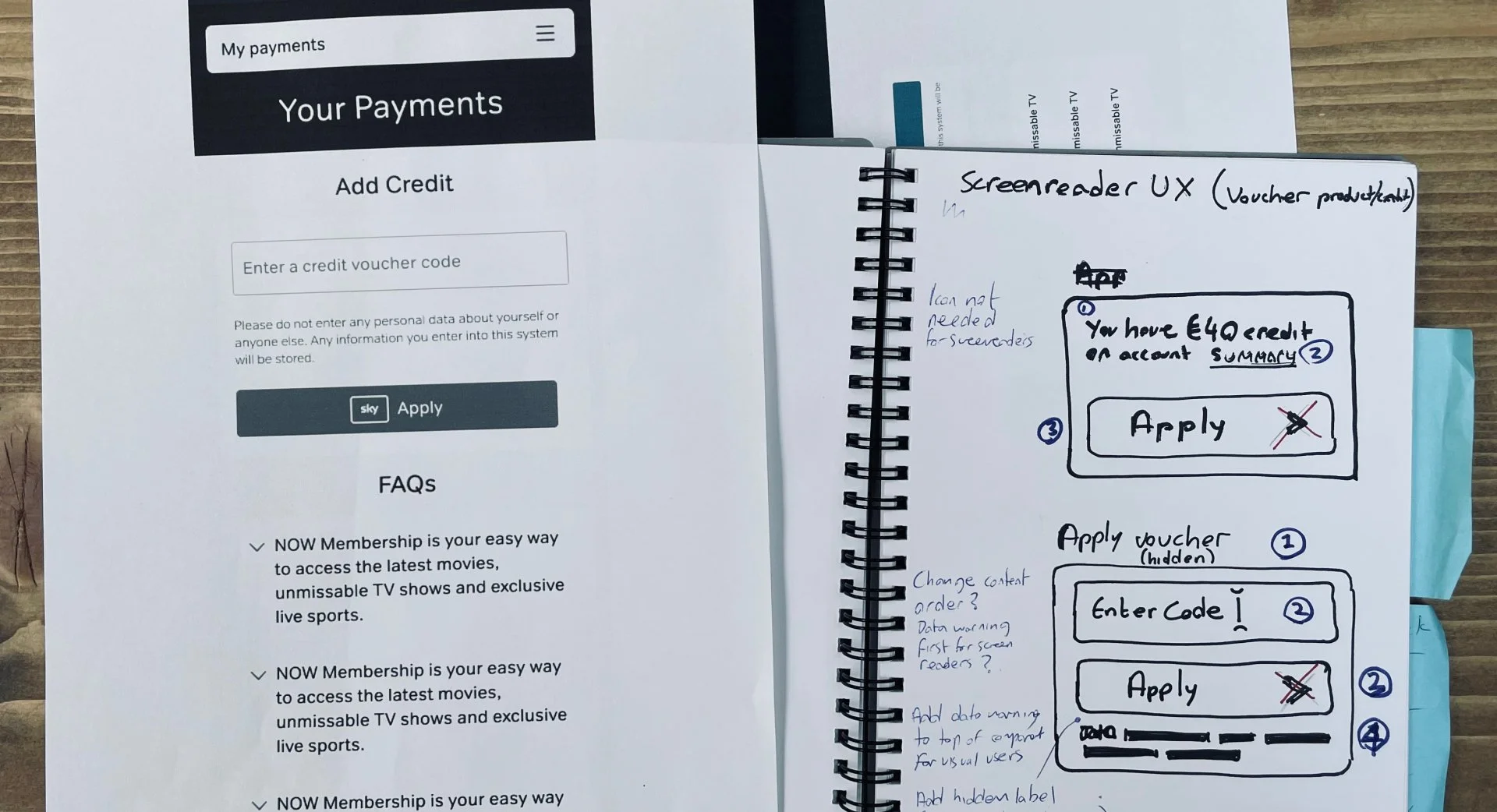
Accessibility investigation
NOW’s web experience has several strategies for ensuring components are accessible.
The Payment Details page redesign allowed us to investigate minor tweaks to various payment components (in this case, the voucher component).
Initial results
By assessing usage data, heat maps, and session recordings from one of our third-party suppliers, we quickly evaluated the MVP. The initial review showed the following results:
Click rate
The FAQ click rate for the Payment Details page was low. We could infer that most users were clear about how to reach their goals.
The payment method component saw the highest level of engagement.
However, further analysis and comparison with Adobe Analytics data are required over a longer period to confirm customer goal completion. The first month of usage showed no increase in contact rate and a minimal decrease.
Float time
Float time was positive. Customers were clicking the CTA almost instantly without giving it much thought, indicating that they knew exactly what they were looking for and could complete their task quickly.
Number of clicks
The number of clicks allowed us to compare how many customers clicked on the CTA to change payment versus other CTAs (e.g., FAQs).
This indicated a clear understanding of what to click on for many customers.
User session reviews
Playback of footage from user sessions reveals several improvements:
Customers can quickly find their payment method.
Time spent on the Payment Details page is reduced.
Customers confidently update their payment information without any hesitation.
Next steps
Following delivery, the design team recommends introducing several enhancements after the MVP launch to strengthen the Payment Details experience.
Audit the various payment types and investigate how we display them.
Merge voucher and payment functionality into one component.
Launch Apple Pay and add Google Pay to the payment types component.
Closer alignment with the NOW Sales journey.